
Core panels
What the live dashboard is showing.
The dashboard starts with a fitted surface and then layers live market context on top of it. That includes quoted option points by exchange, tenor summaries, node-level views, and calibration health indicators that can explain why a shape changed.
- Variance and volatility smile curves by expiry.
- Interactive 3D surface view for vol or variance.
- Smile matrices with bid, ask, and last-trade IV points.
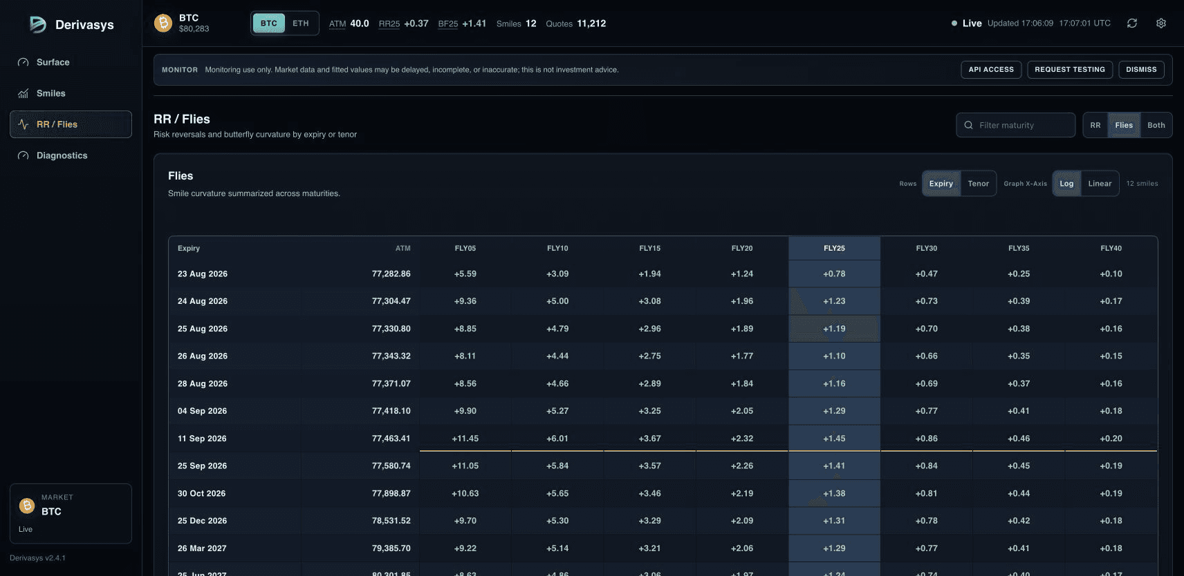
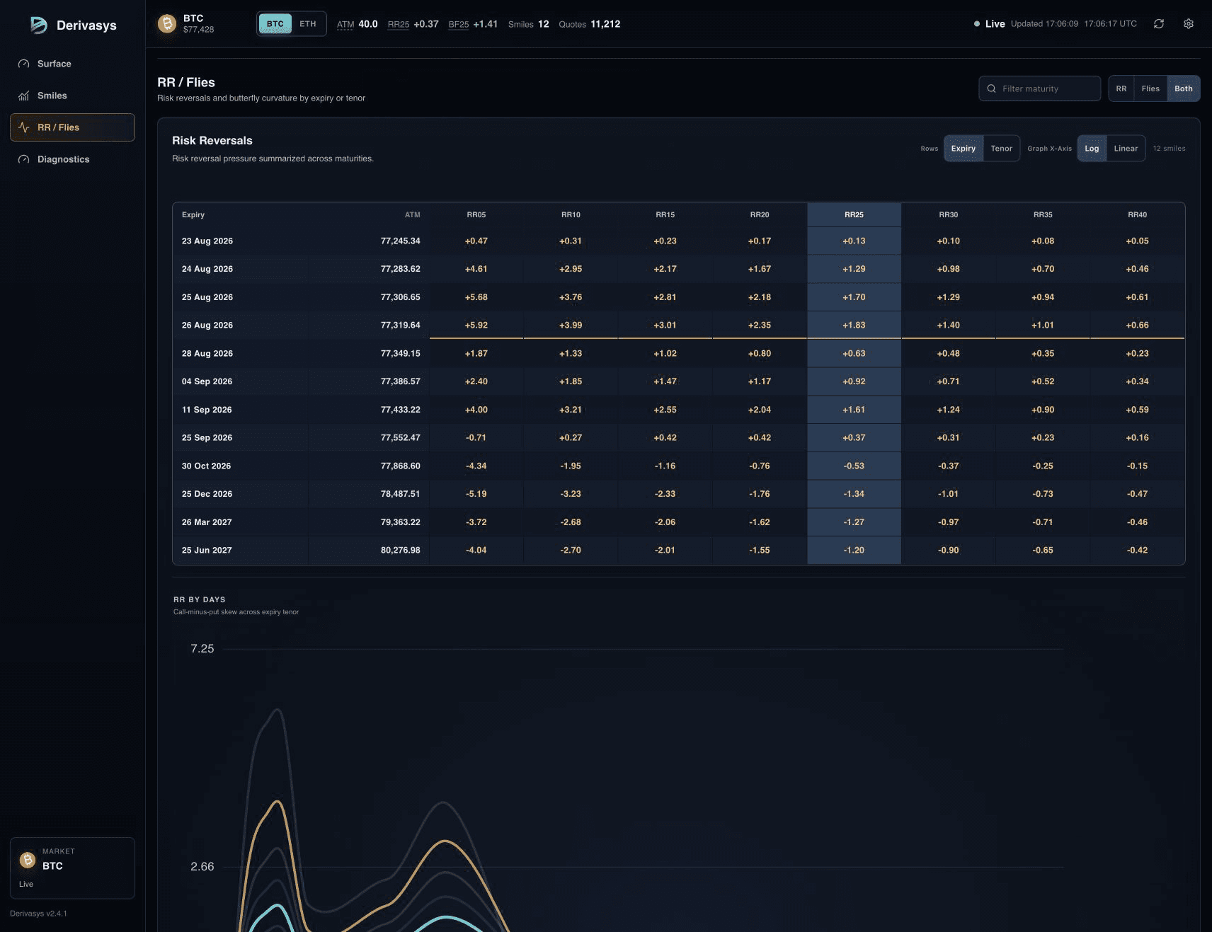
- RR and fly grids in expiry and tenor modes.
- Fit diagnostics and g-test style fit views.
- Fixed-tenor term-structure rows for normalized maturity views.
- Beta WebSocket snapshots/patches by request; REST behavior remains testing under evaluator-specific terms.
Live outputs
The same objects can be exposed through the API.
Approved evaluators can receive beta WebSocket snapshots and patches by request. REST behavior remains in testing, is supplied only under evaluator-specific terms, and is not generally available.
BTC, ETH, SOL, XRP, HYPE, AVAX and TRX are verified live product currencies. Current venue and expiry support remain visible in the dashboard rather than being implied from generic controls.
Risk language
What RR and flies mean.
RR means risk reversal. It summarizes skew by comparing implied volatility on an upside call wing with implied volatility on a downside put wing at the same delta or moneyness bucket.
A fly summarizes curvature: how expensive the wings are versus the ATM area of the smile. Together, RR and fly metrics make all seven live crypto smiles easier to scan with the same definitions.
Fit tab
What the Fit tab shows.
The Fit tab shows the fitted variance view, fitted volatility view, 3D surface projection, and g-test diagnostics published by the engine.
Those diagnostics expose arbitrage conditions: butterfly-style smile checks, calendar consistency across expiries, and fit-error movement over time.
Delivery
Why real-time updates matter.
Surface quality is not static. Quotes move, liquidity shifts, and venue overlays can disagree. A real-time dashboard makes it easier to distinguish structural repricing from transient dislocation, stale venue levels, or temporary calibration stress.
The UI is driven by websocket snapshots and patches. Full snapshots establish the current state, while sparse patches update only the expiries or derived views that changed.